


BACKGROUND
David Kushner creates music that feels heavy, intimate, and cinematic.
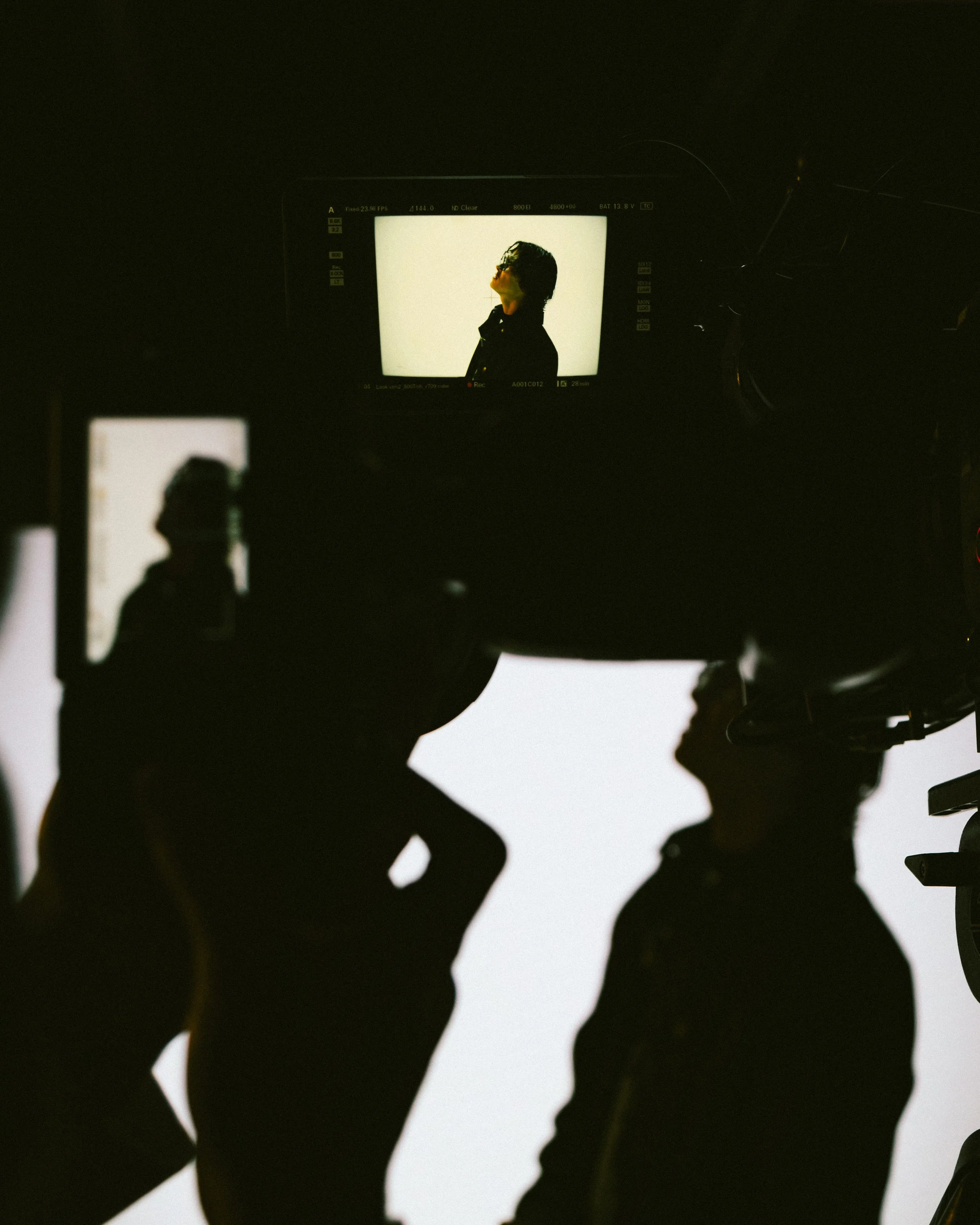
We worked together to translate that feeling into a visual world.
Not just for one release, but across everything surrounding it.
From album artwork to merchandise to ongoing creative direction, the goal was simple.
Make the visuals feel like the music sounds.


THINKING
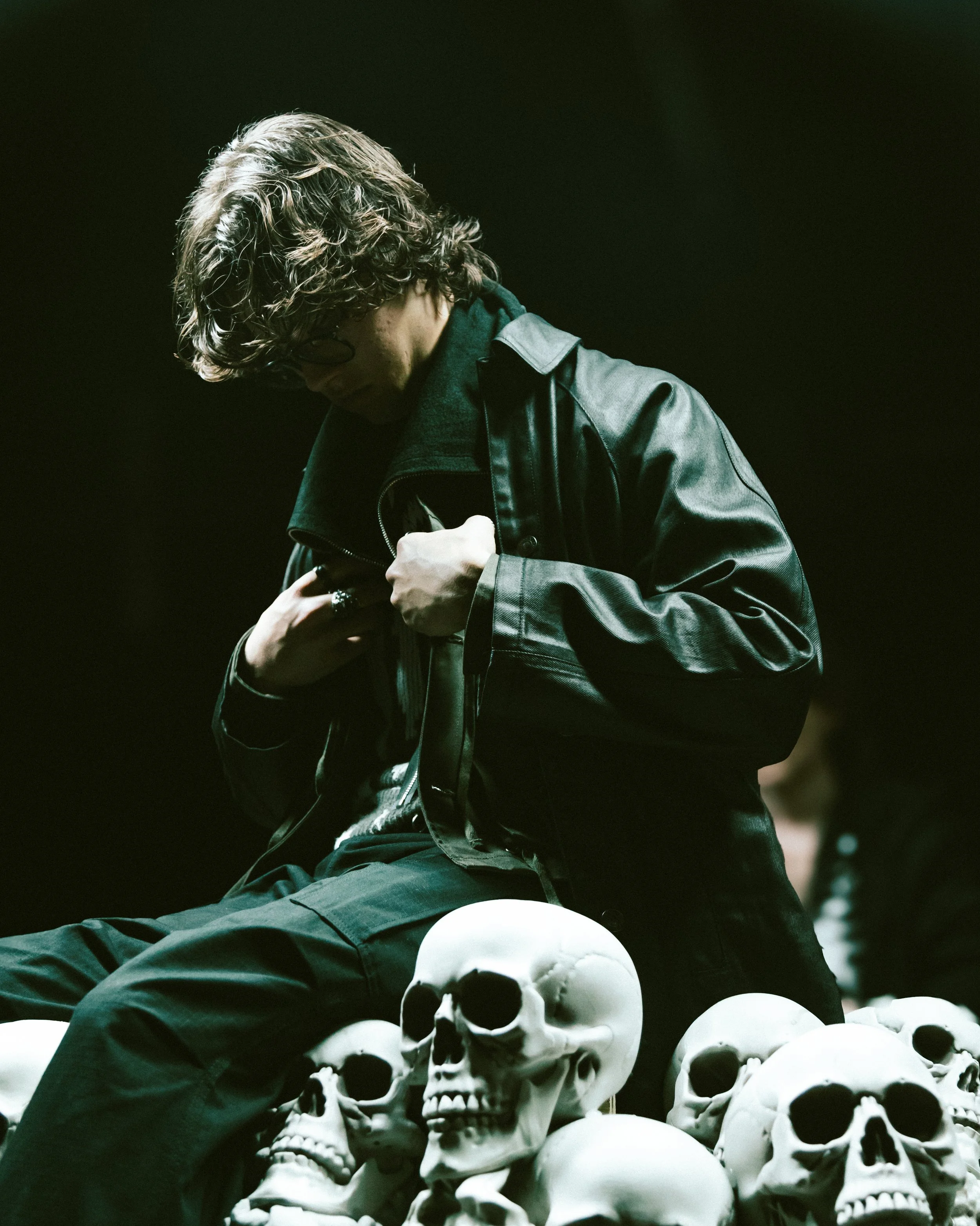
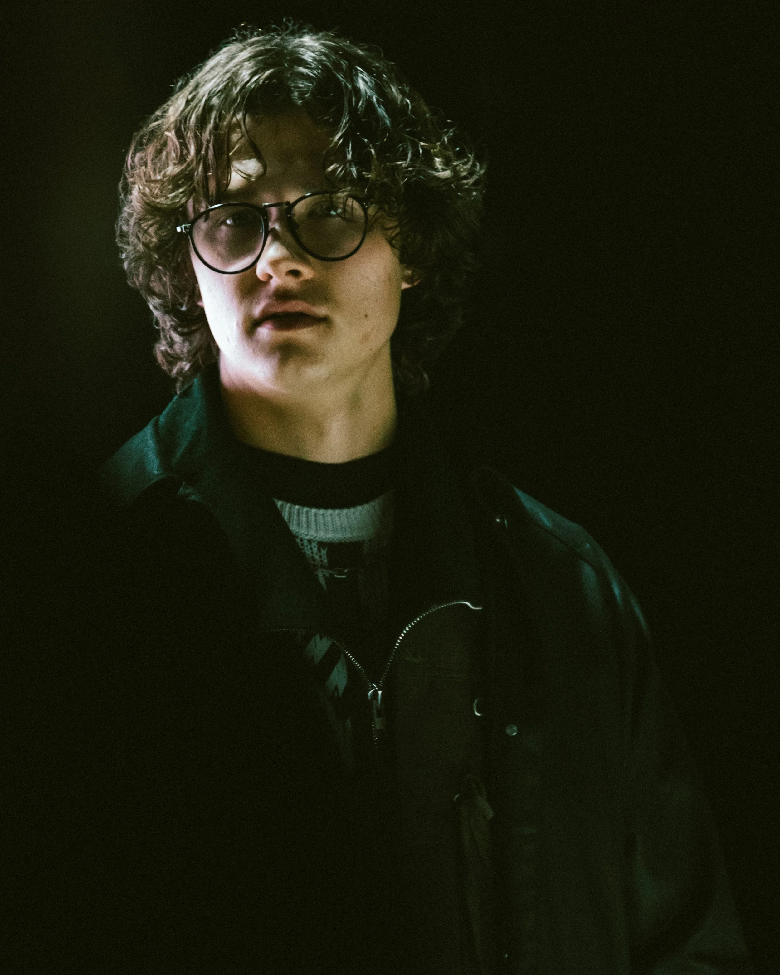
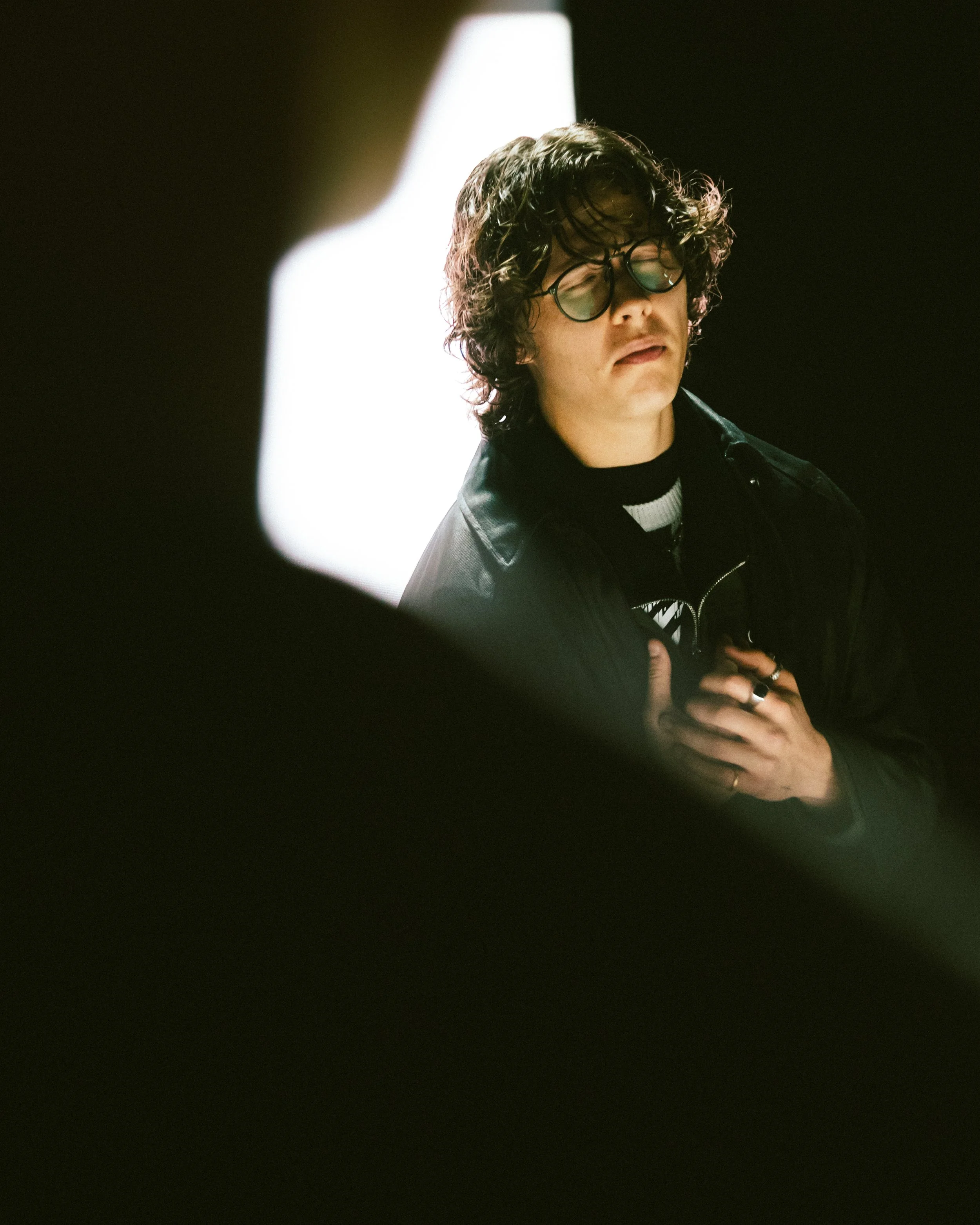
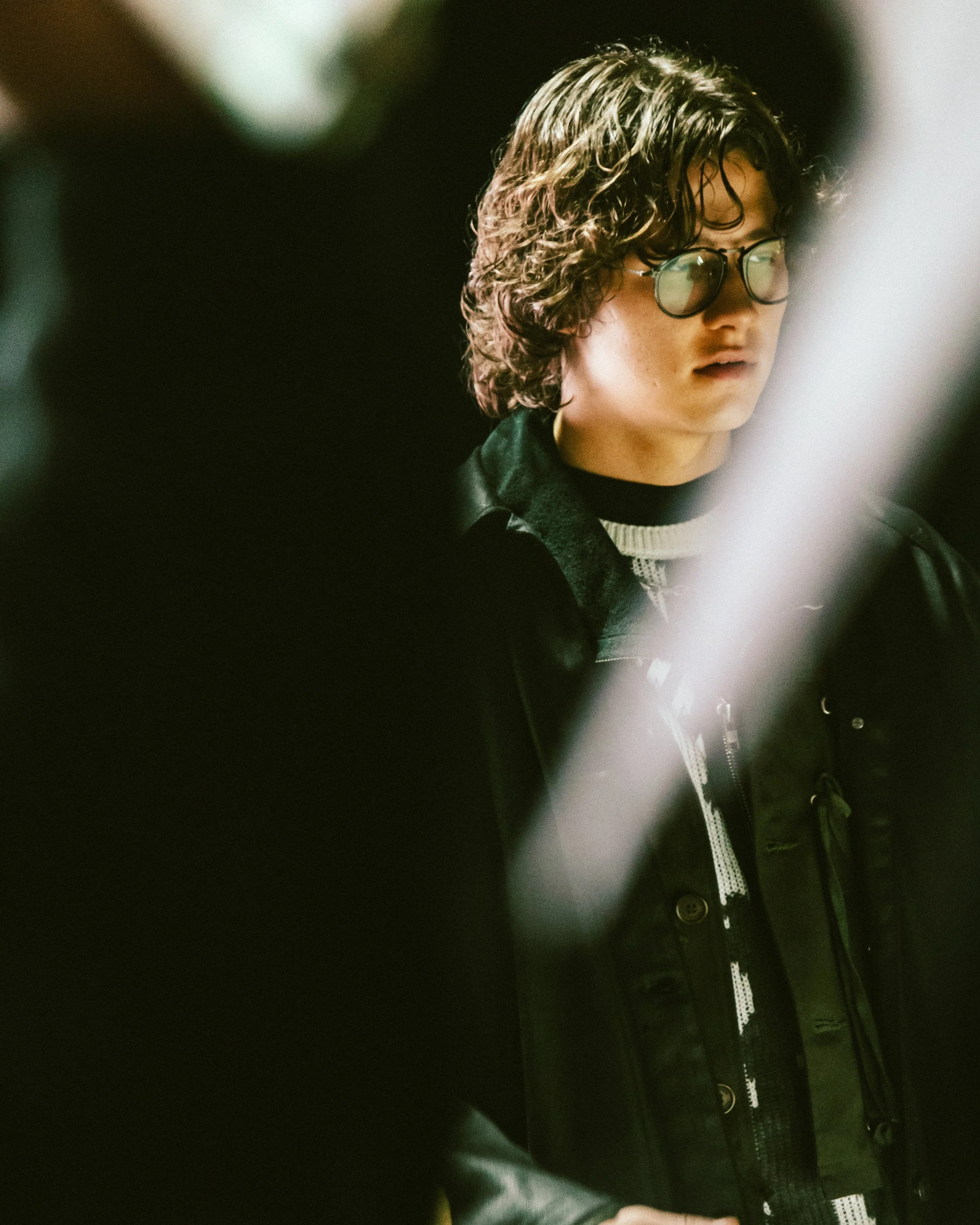
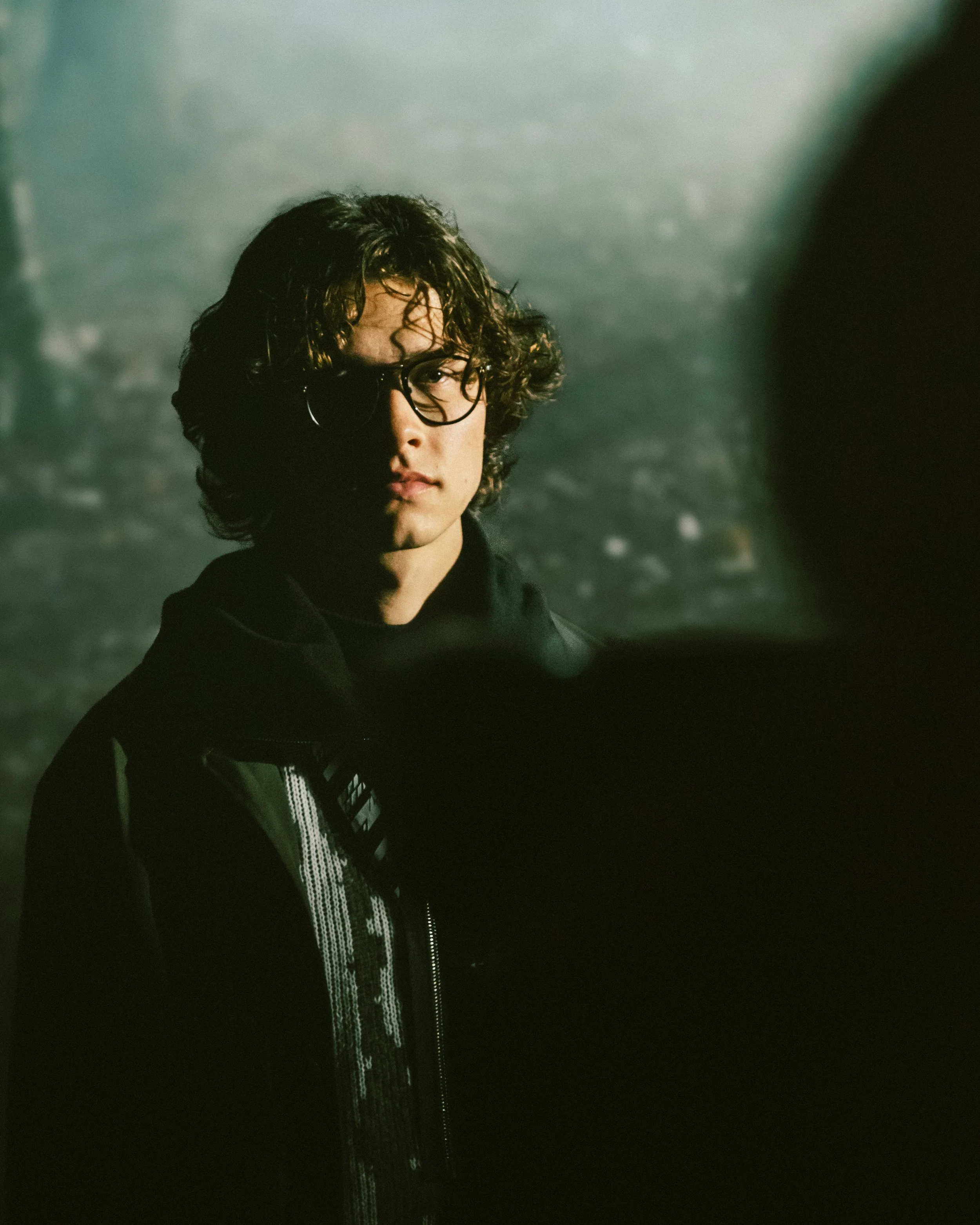
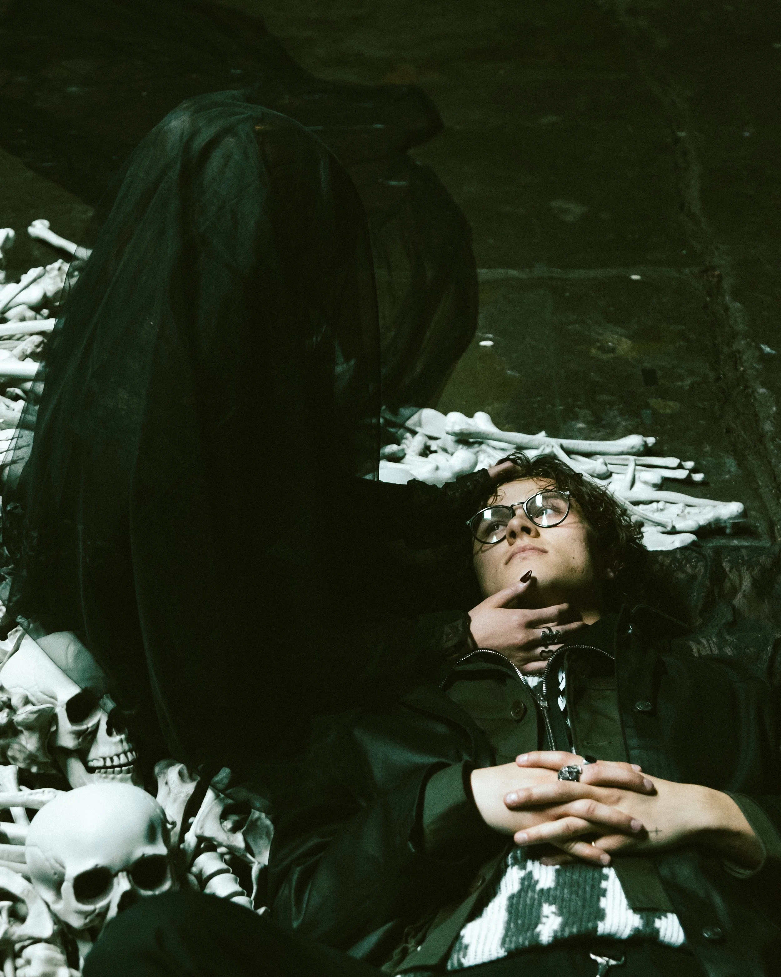
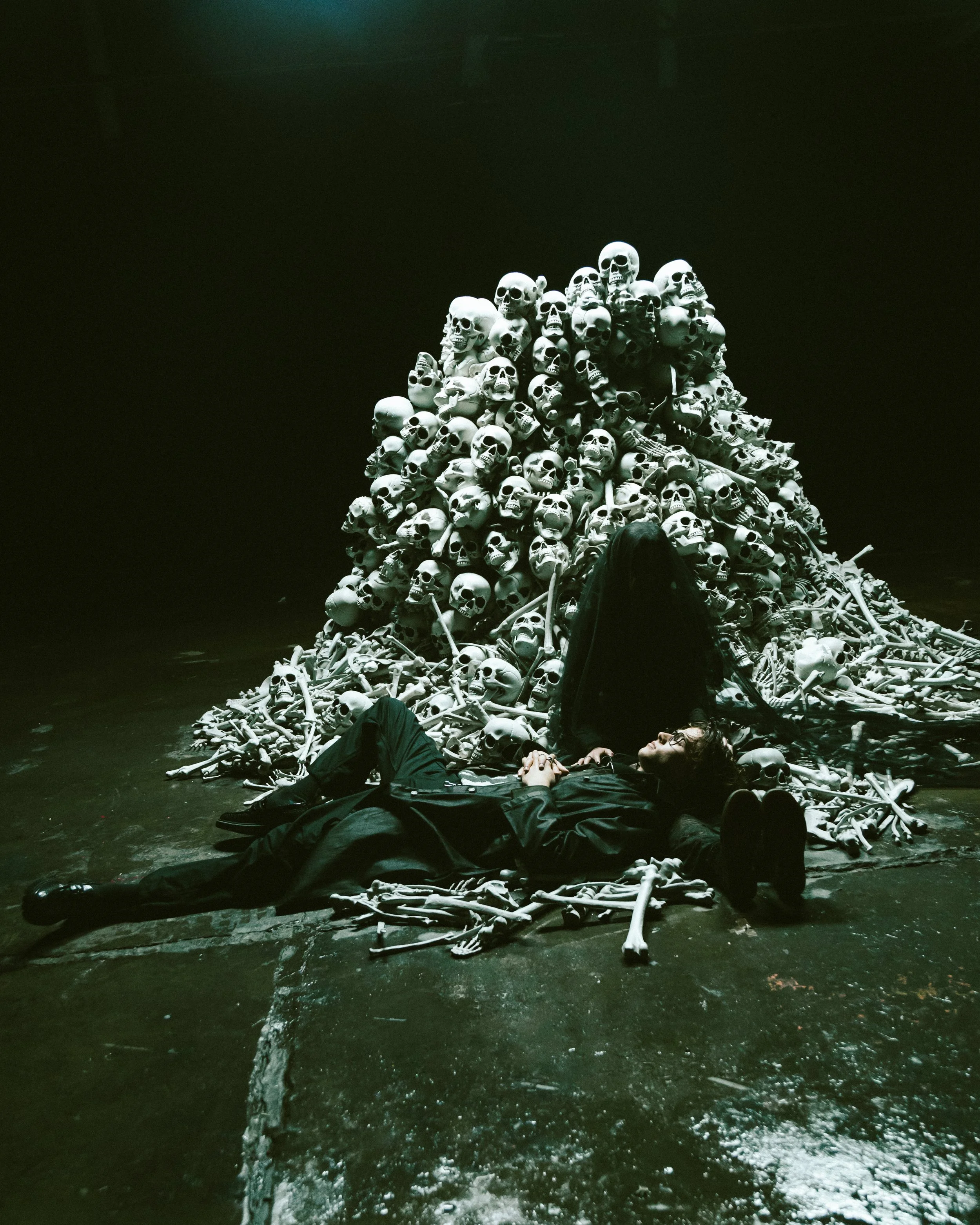
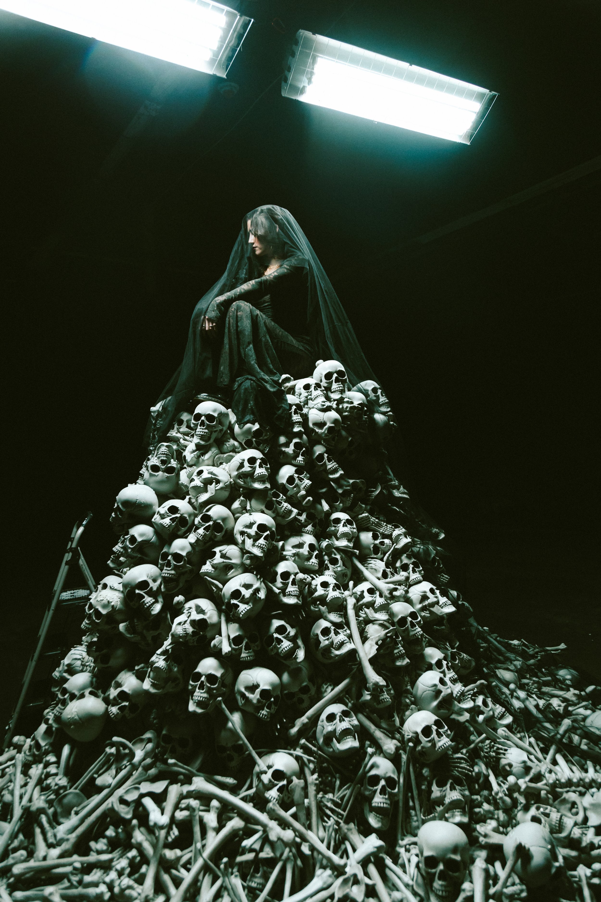
David’s music does not sit on the surface. It pulls you inward.
So the visuals needed to do the same.
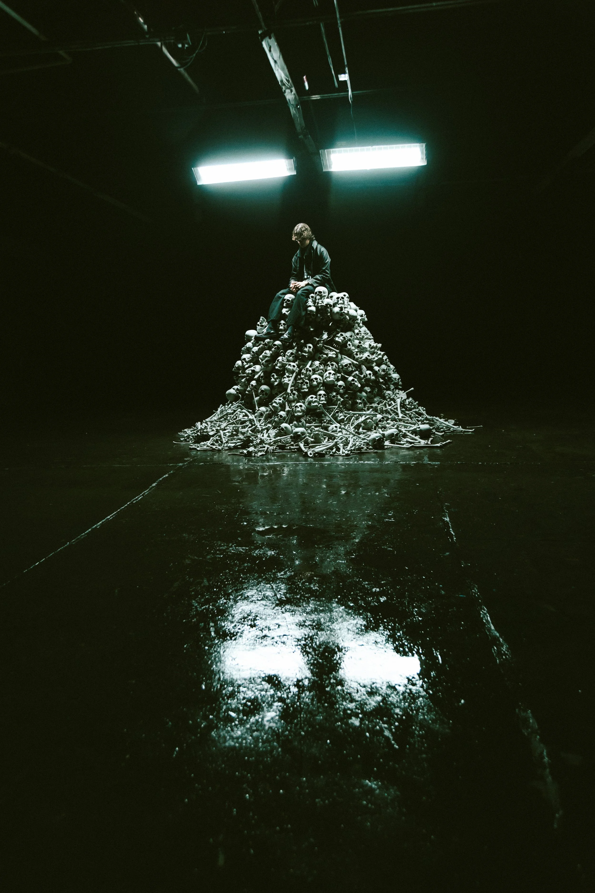
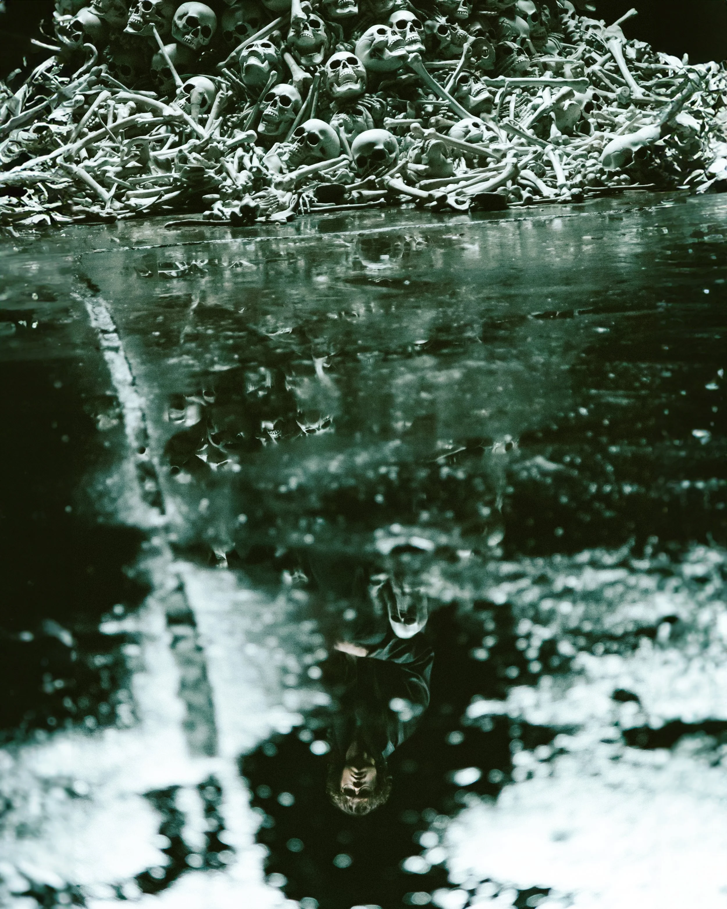
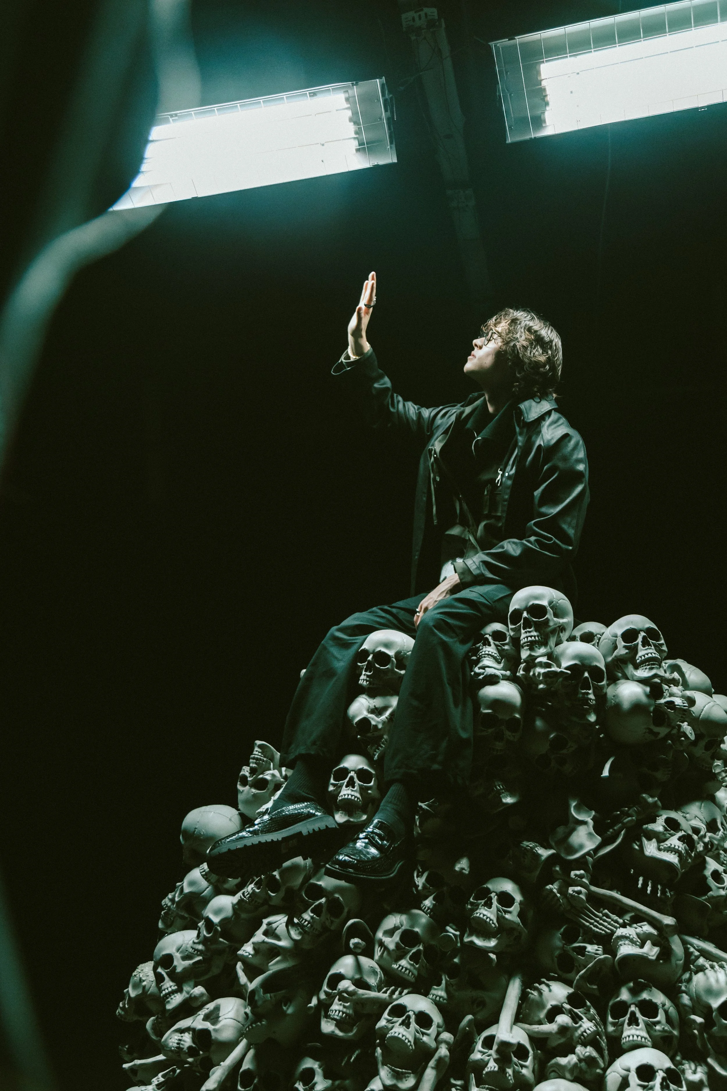
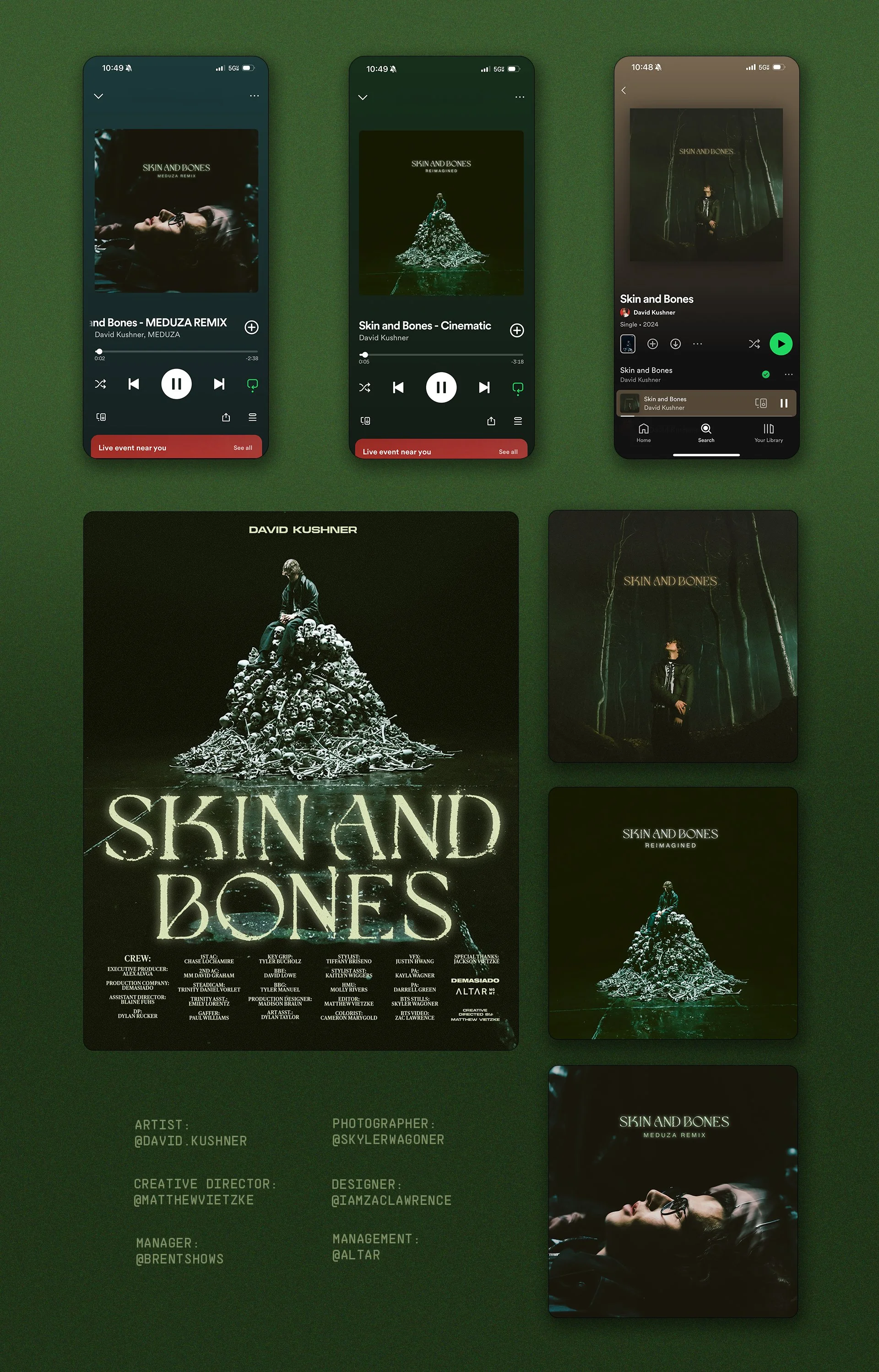
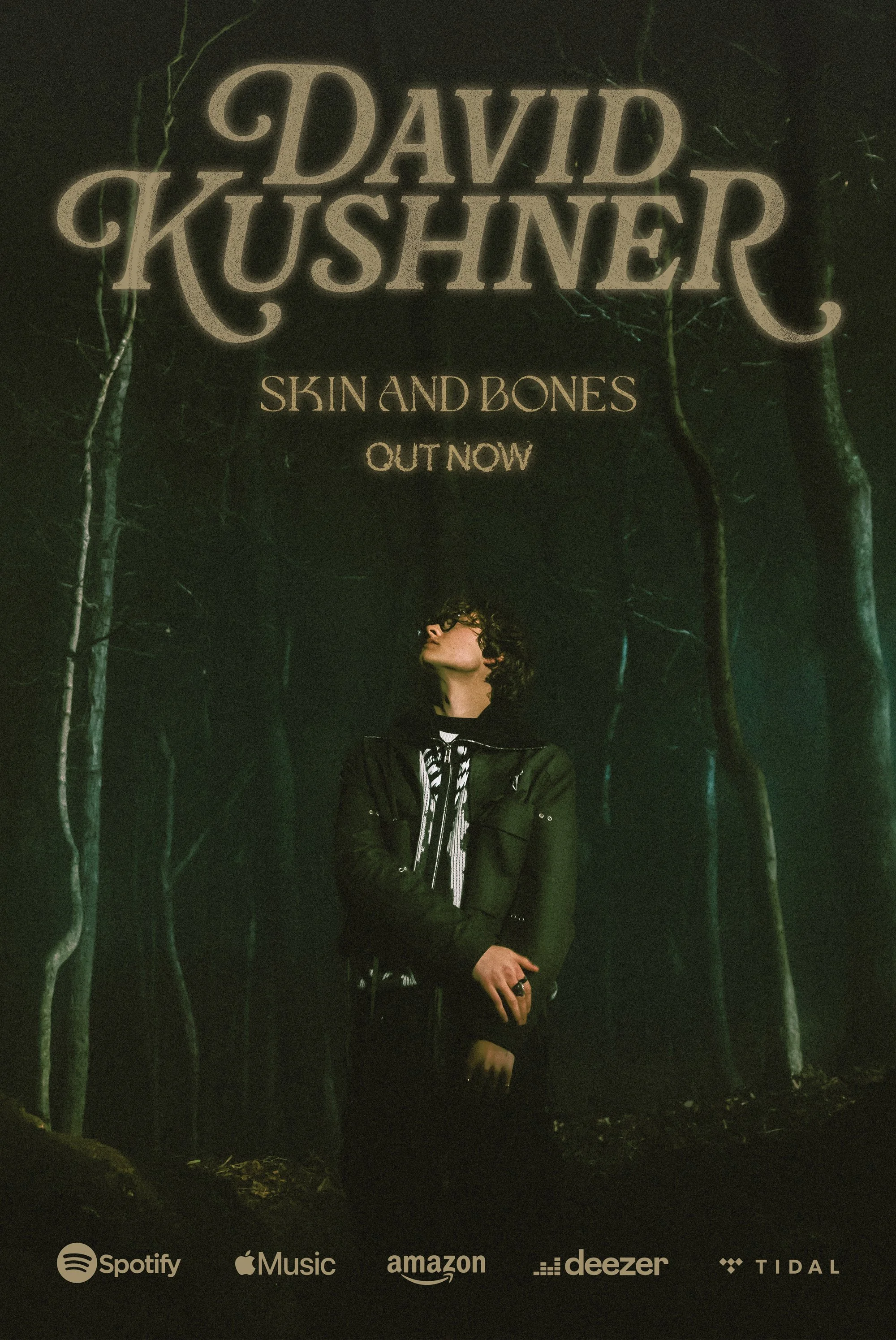
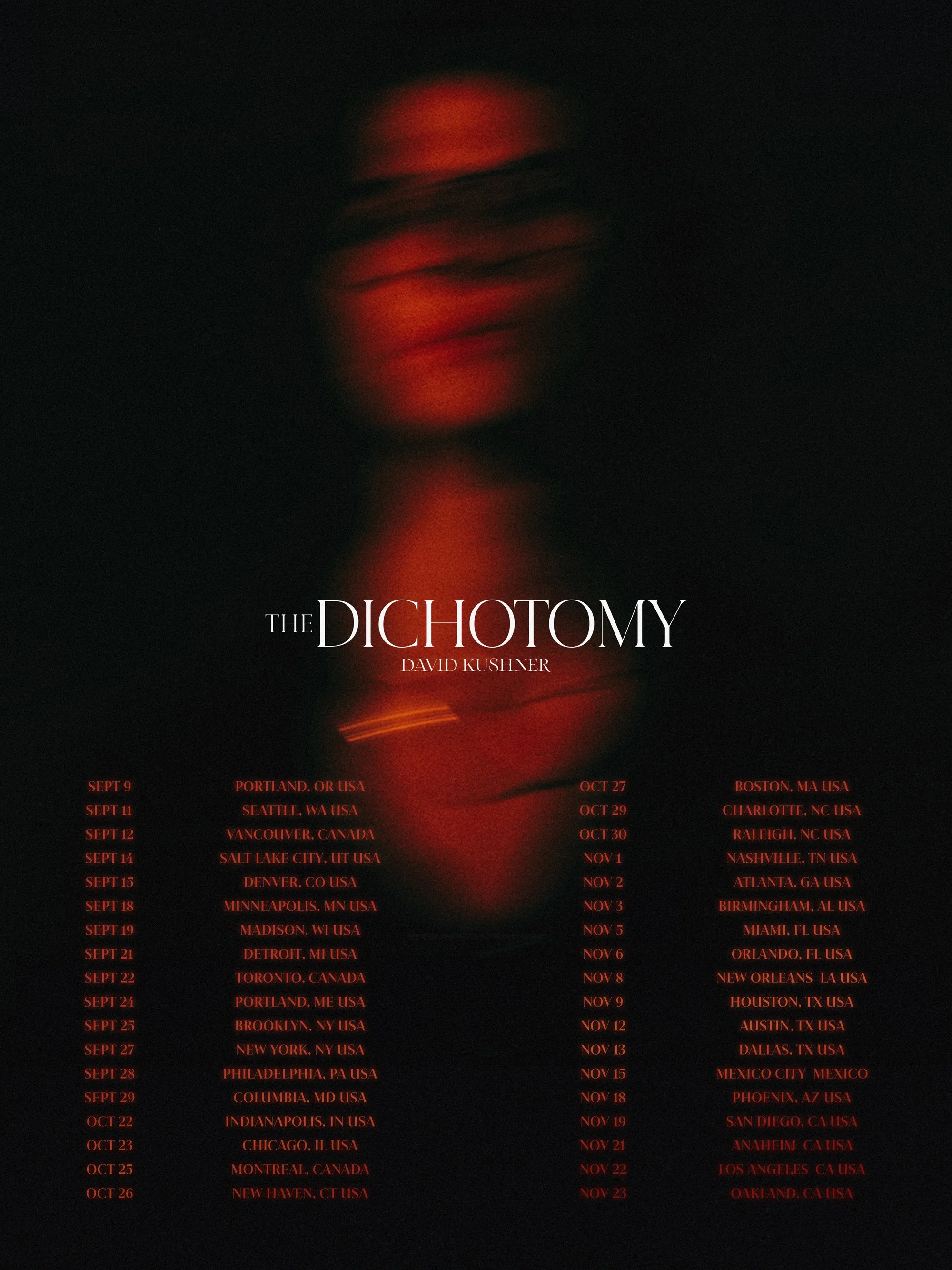
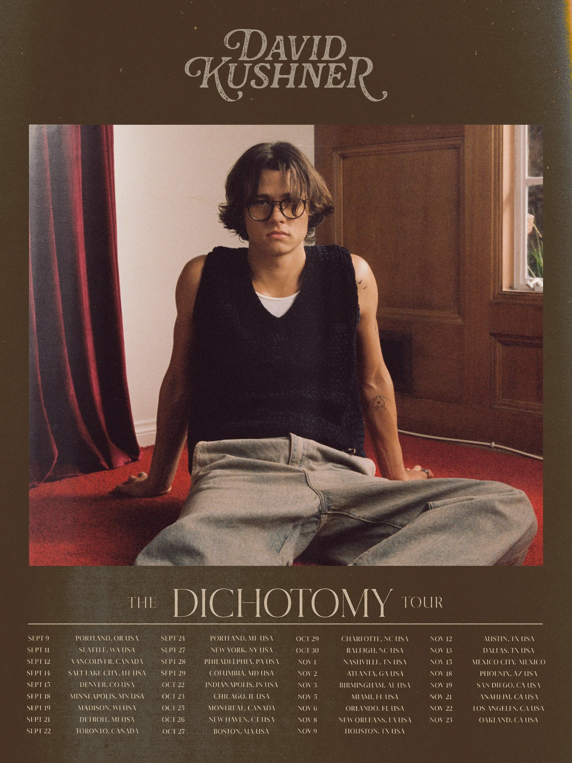
Rather than treating the artwork as decoration, the goal was to create something symbolic. Something that felt like it existed before the viewer arrived.
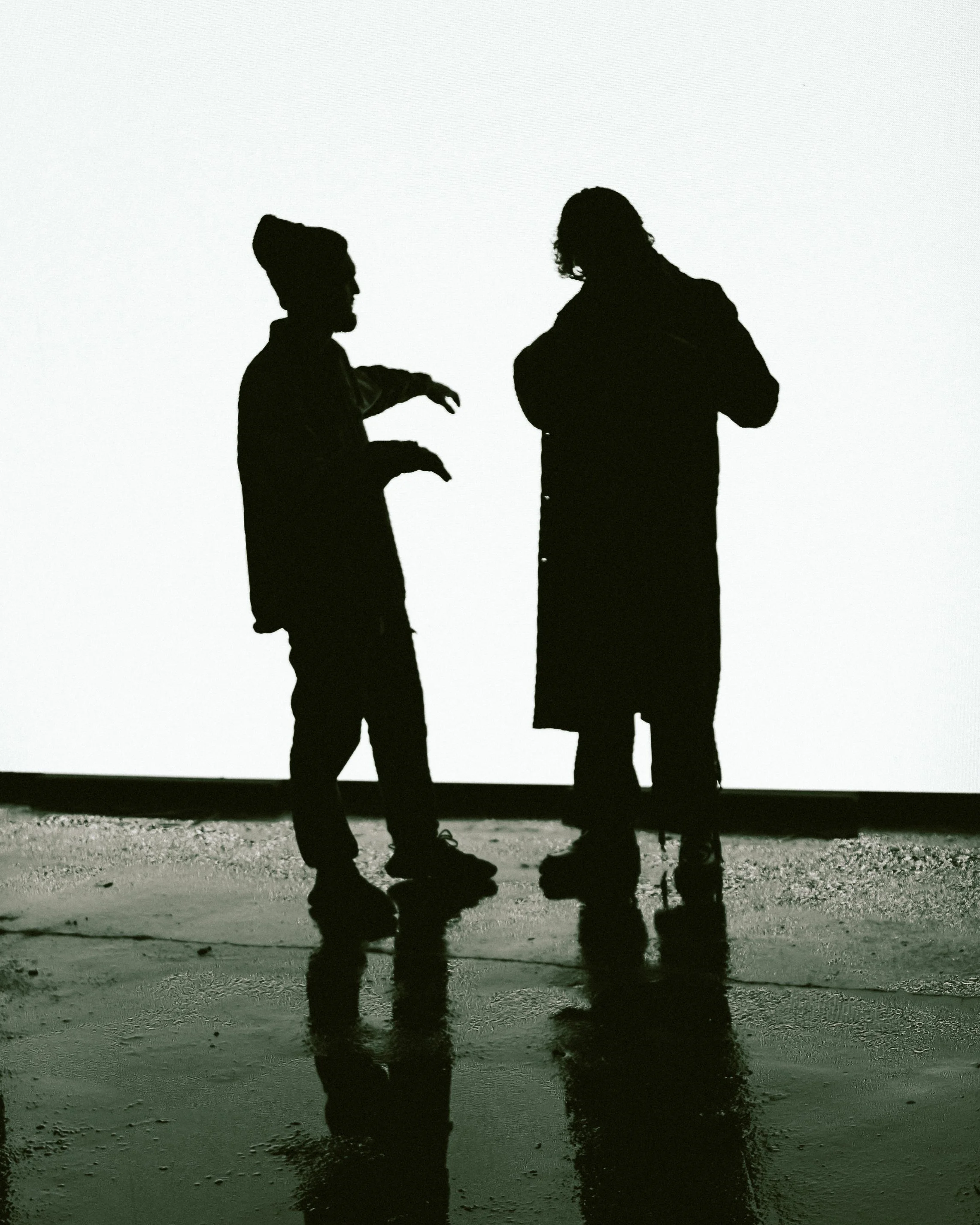
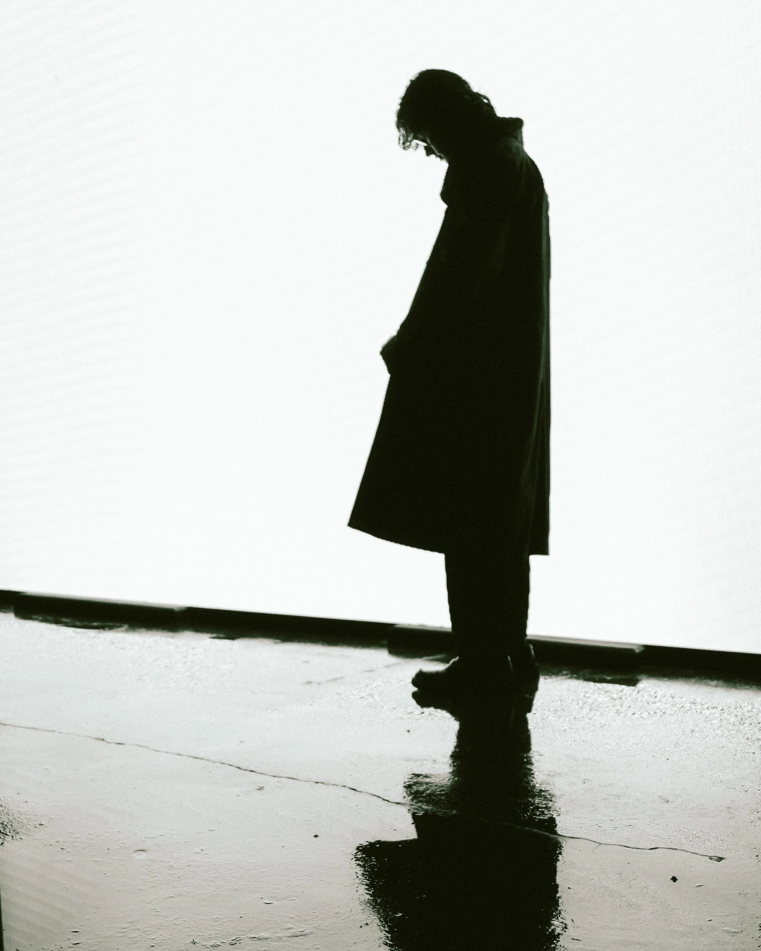
The imagery leans into contrast. Light and shadow. Presence and isolation. Stillness with tension underneath.
At the center of it all is a simple idea.
Emotion has weight. And if you can see it, you can feel it.
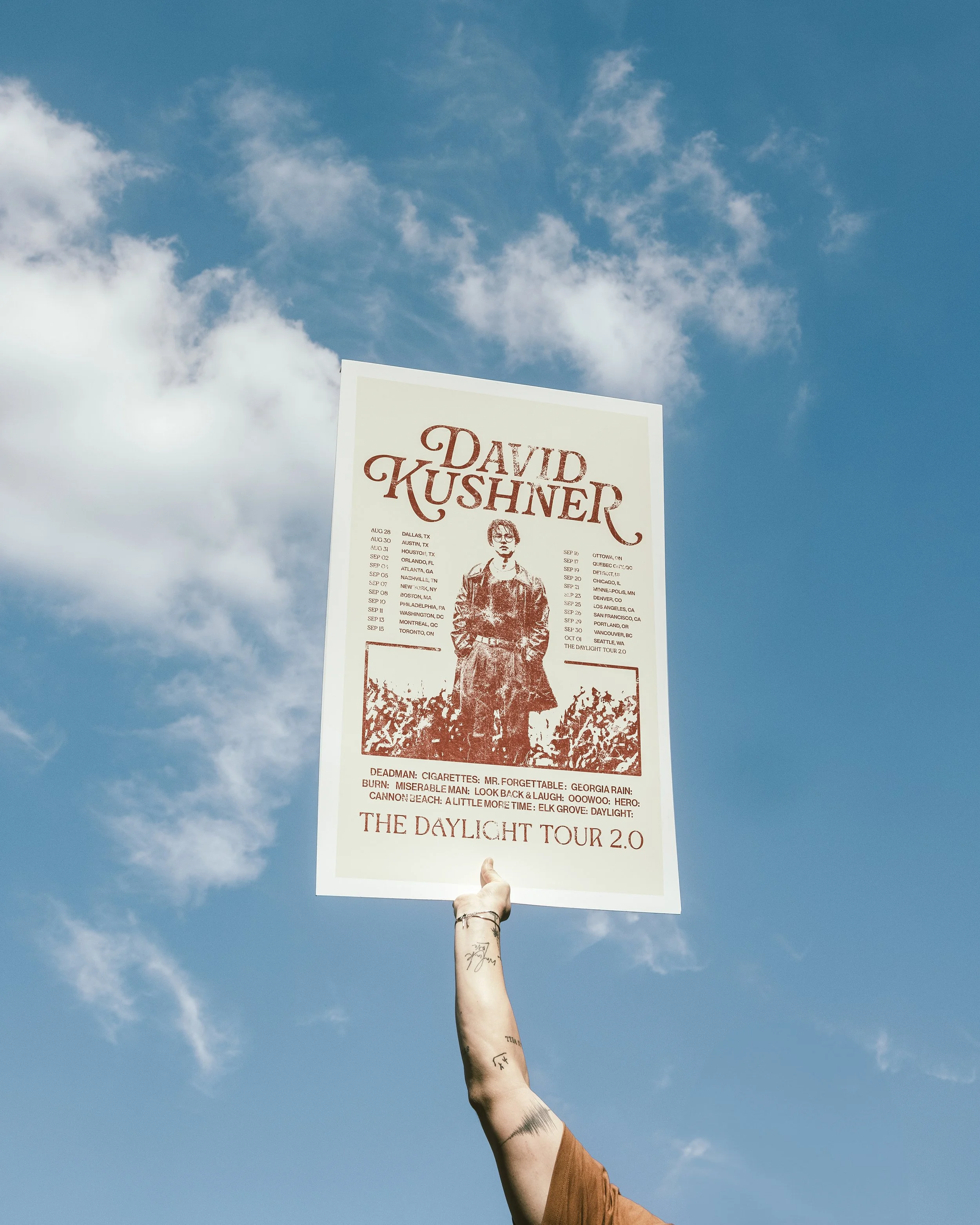
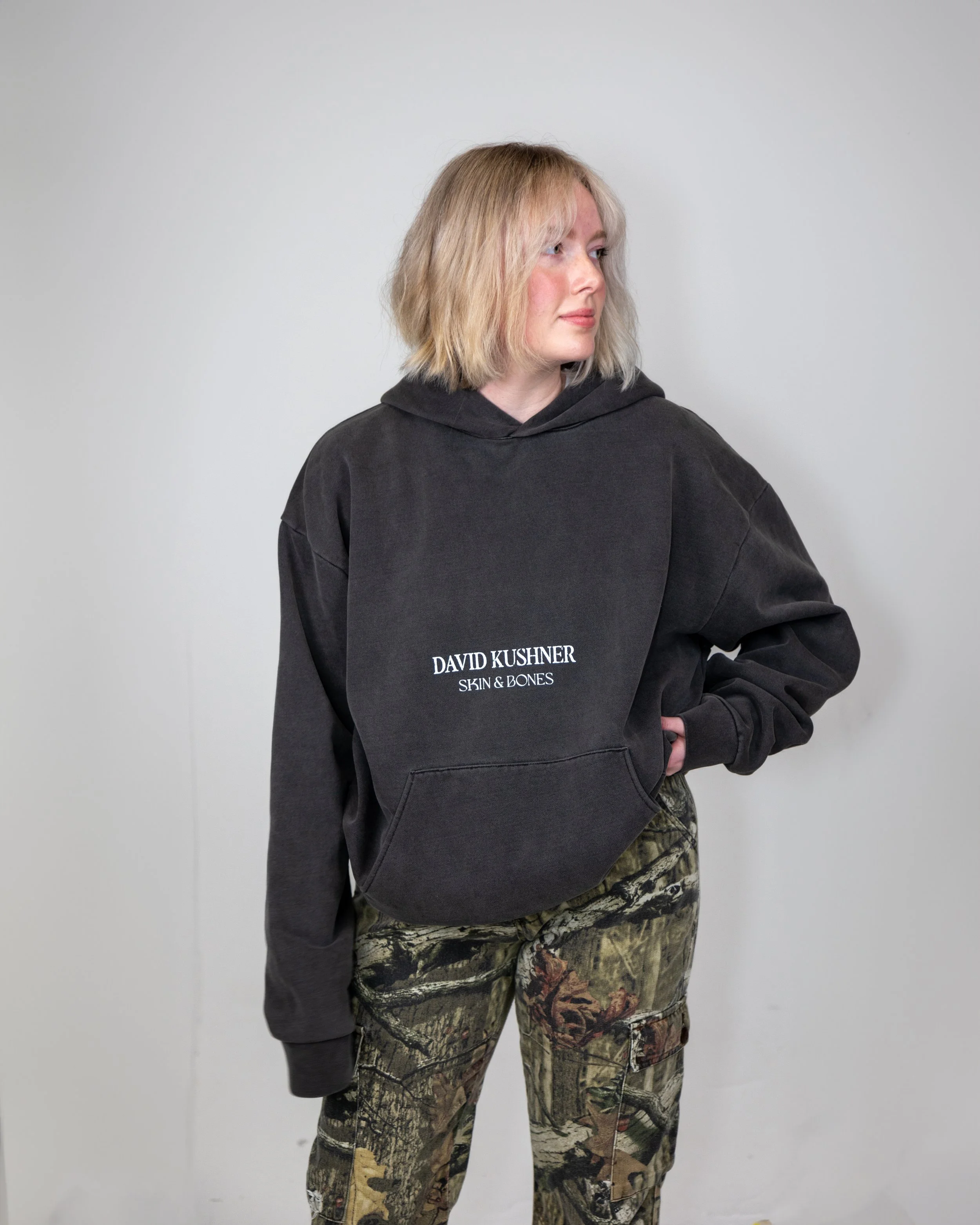
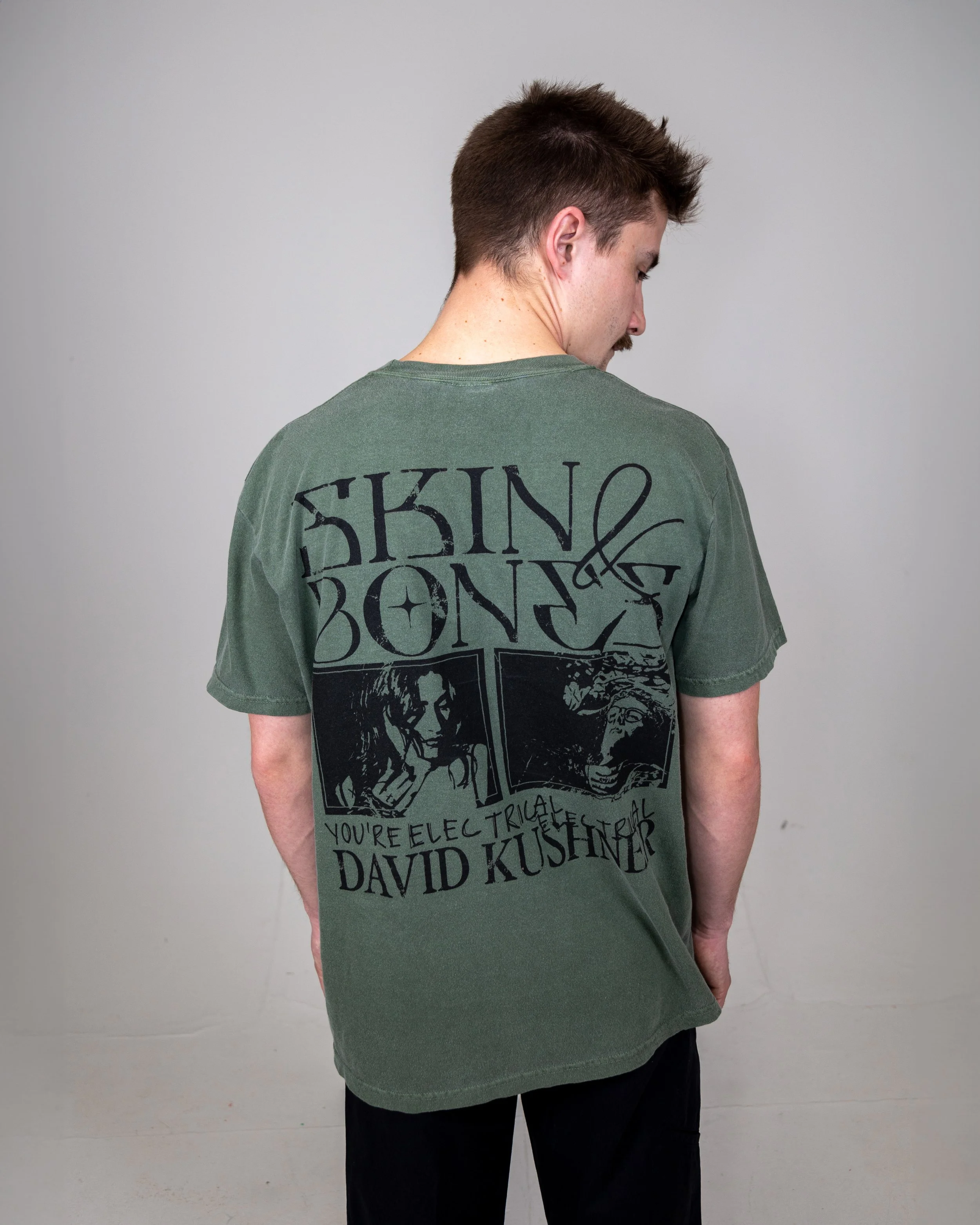
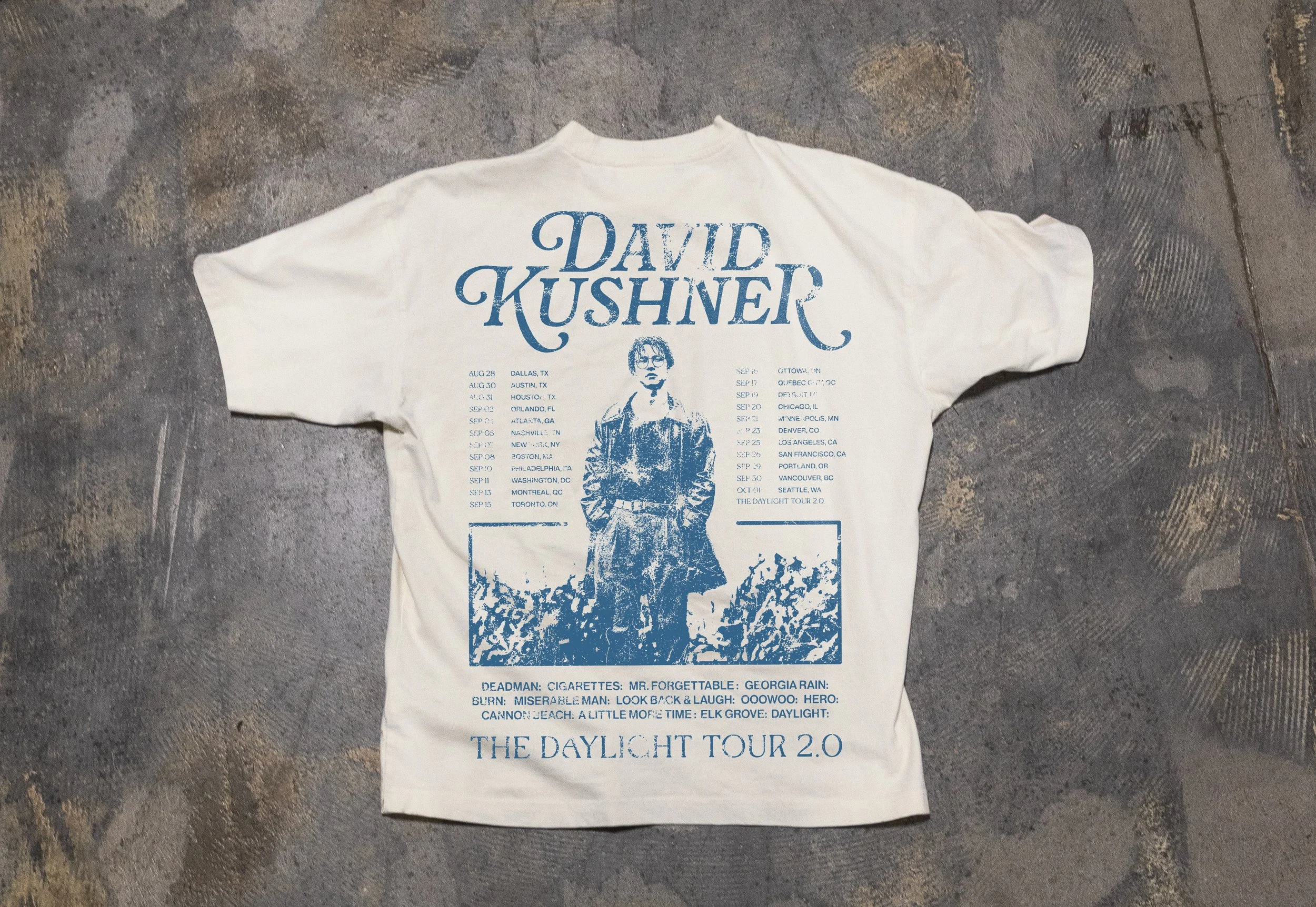
BRAND EXTENSIONS
All brand extensions carry the same tone.
Nothing feels like an afterthought.
Heavy fabrics. Minimal front details. Expressive back graphics.
Pieces that feel like artifacts from the world, not just promotional items.
Everything stays aligned to the same visual language. No breaks in tone. No dilution.
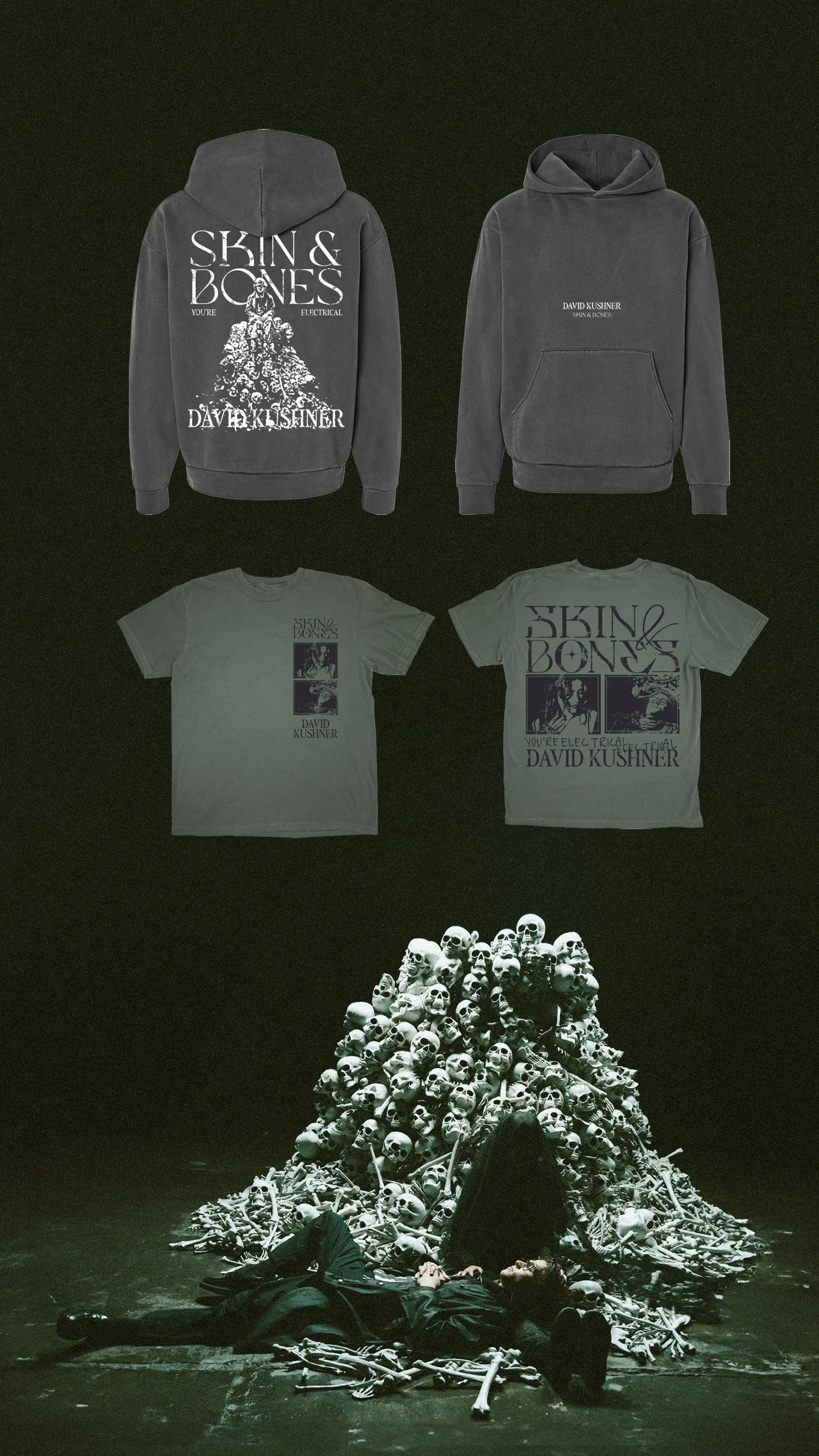


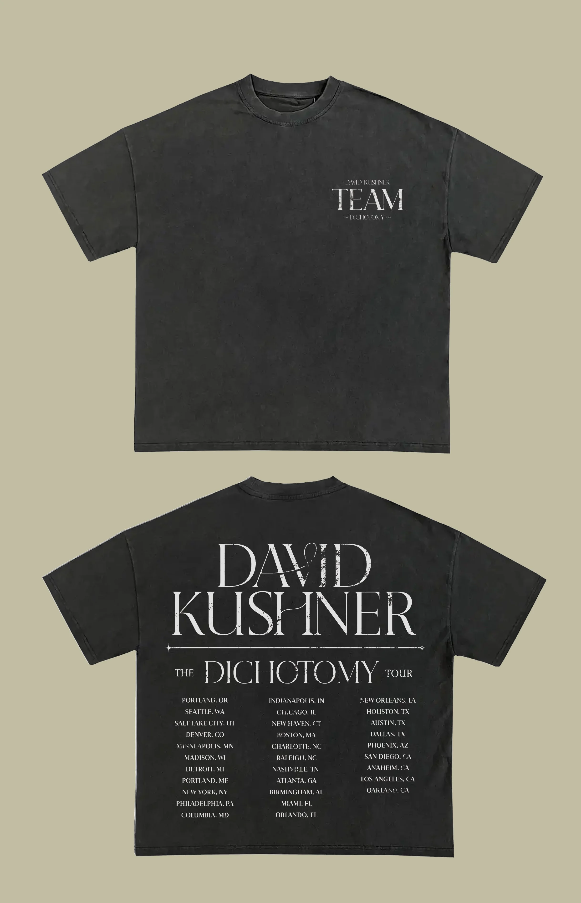
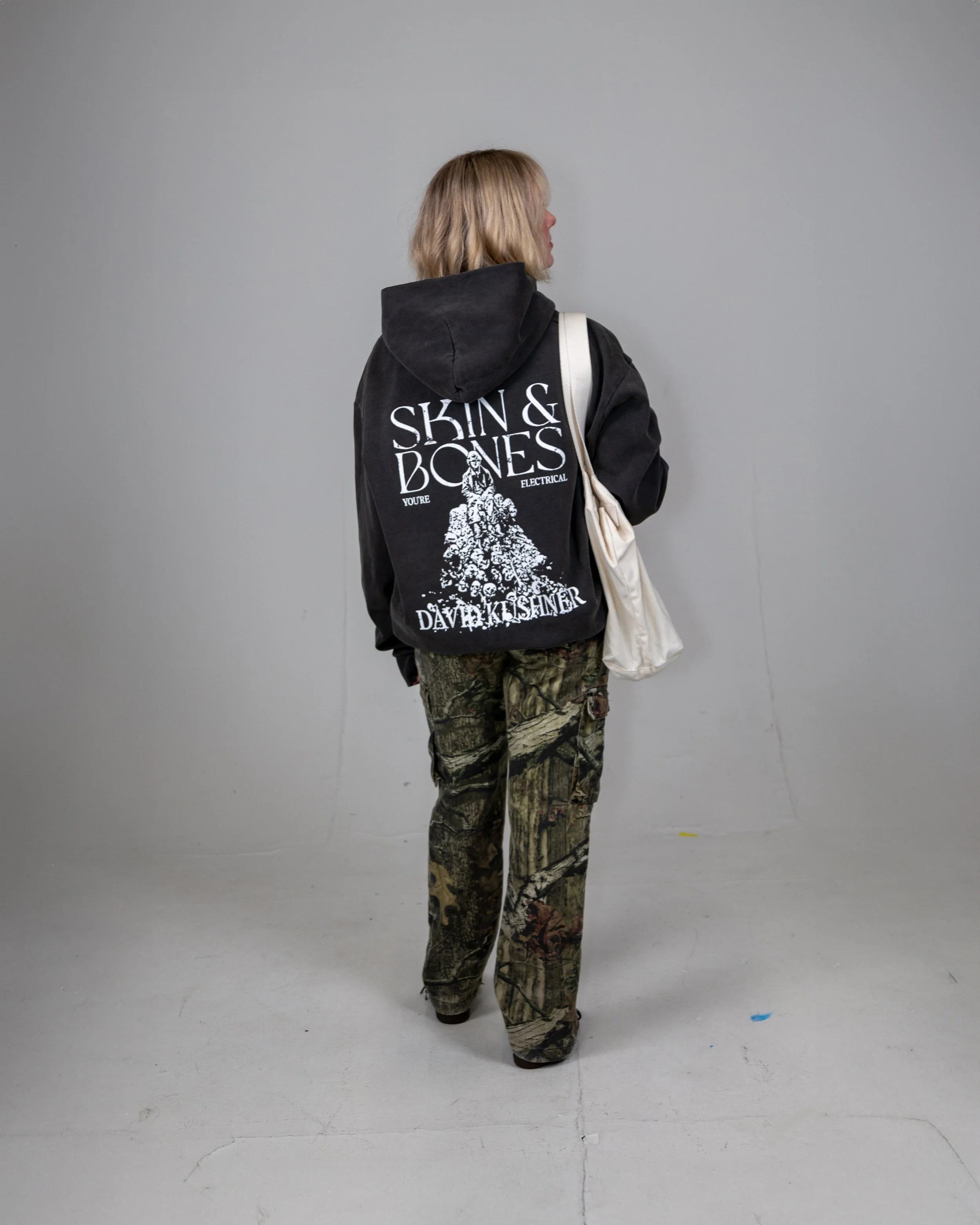
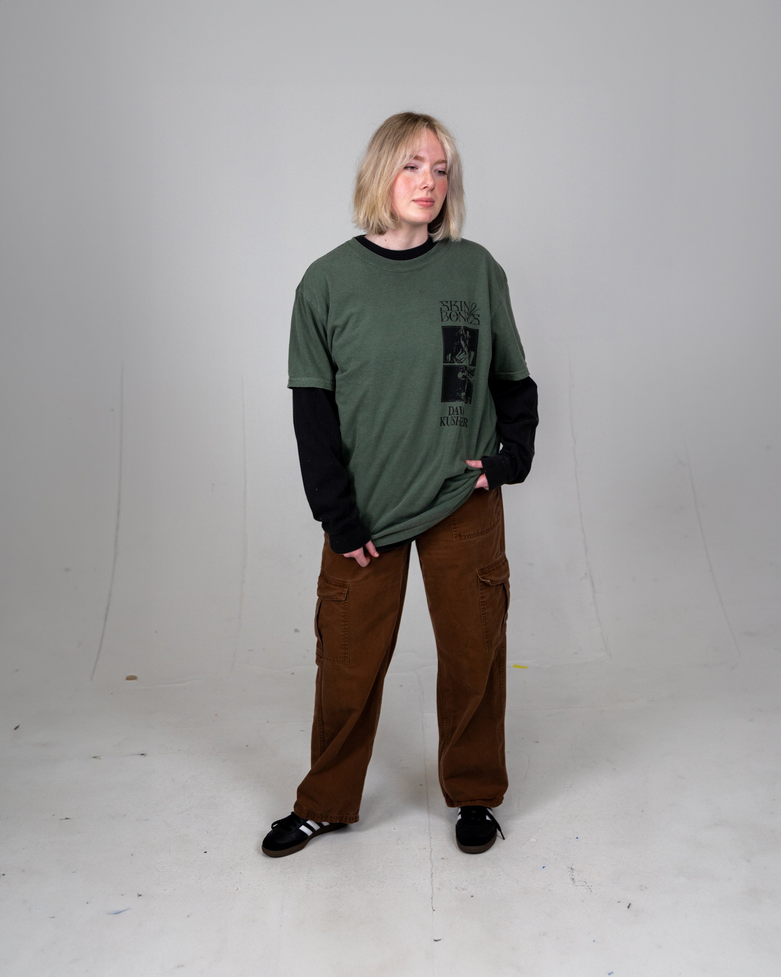
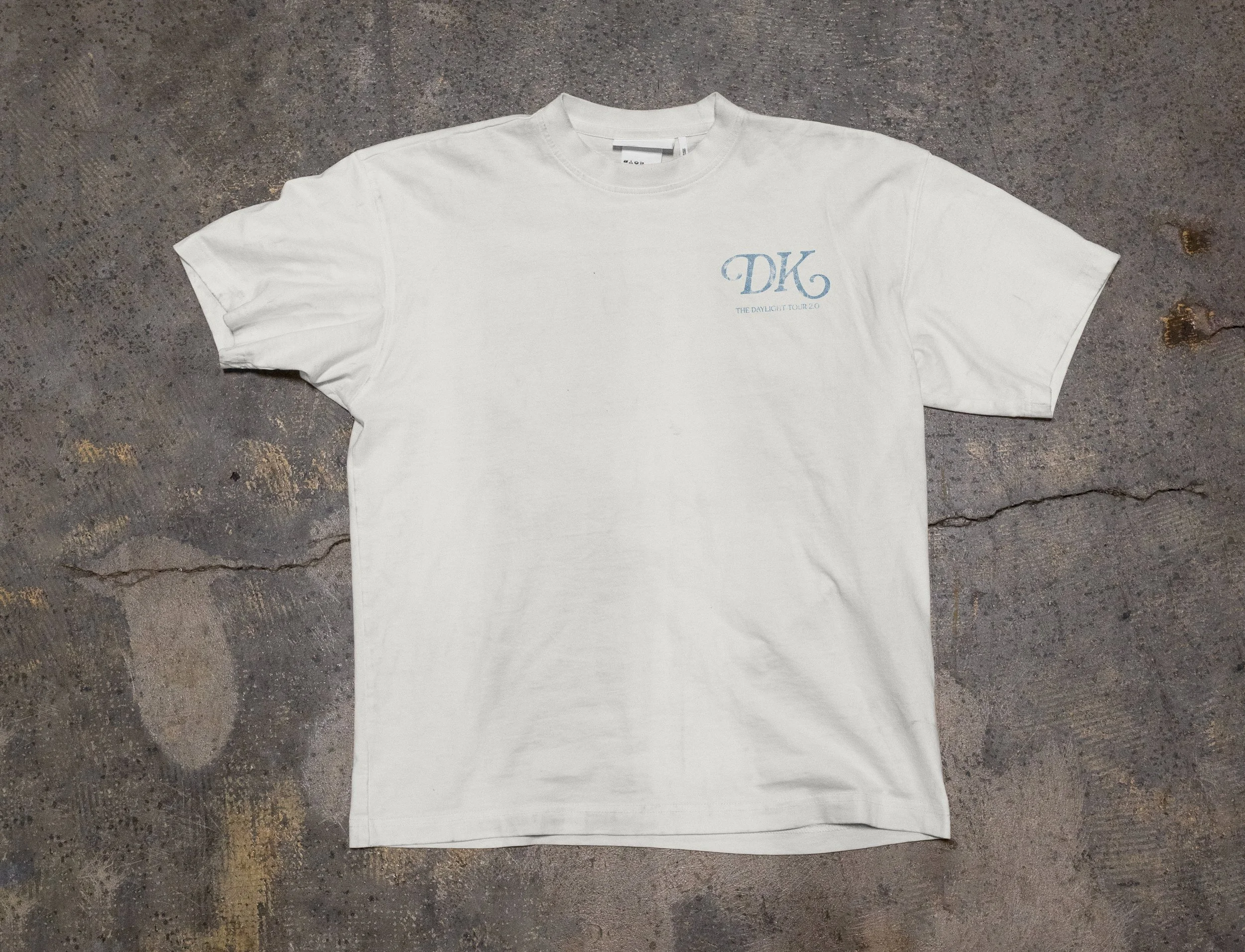
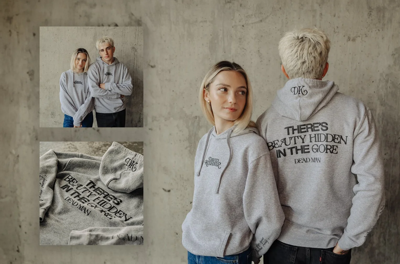
A world you can see, hear, and wear.